🙋♂️ About Me
📧 tomsimpsonts@live.co.uk
📞 07789660023
2024-2025
TEXA UK
2021-2024
RLI - Retail & Leisure International
2020-2021
2.7 Facades / PergolasUK
Other
Navigation;
Mass Email
For the Trutex mass email, I wanted to make sure the design felt warm and inviting, but also professional enough to reflect the brand and drive sales. My focus was on keeping it simple, clean, and easy to read for the target audience of busy parents, while still presenting Trutex as a trusted and established company.
My goal was to balance clarity for parents (the primary B2C audience) with a clean, branded design aesthetic that reflects Trutex’s long-standing reputation.
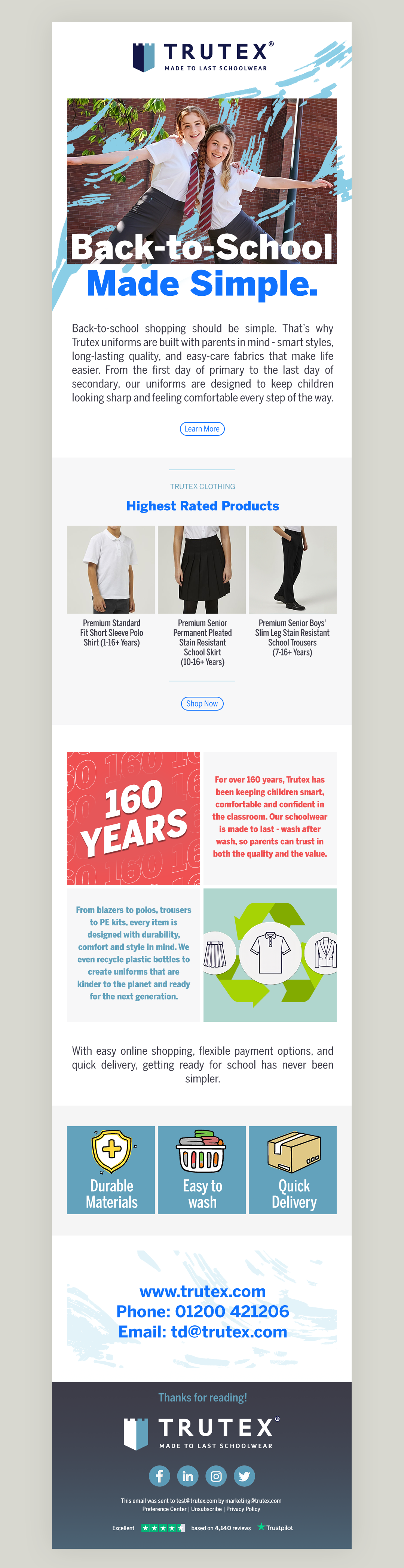
I selected the BentonSans and BentonSans Condensed font families to give the layout a modern yet formal feel. This choice provided a clean, legible structure without leaning too heavily into serif styles. The typography establishes hierarchy clearly, helping readers scan through relevant information quickly.
It gave me that formal, business-like tone without feeling heavy or overly corporate. It helped keep the email approachable while still looking polished.
To avoid a static or overly text-heavy design, I introduced subtle image effects and graphic flourishes. These help break up the information flow, while also adding digital interest and guiding the eye toward featured products and calls-to-action. I created custom pictograms in Illustrator to highlight features, reinforcing brand values with simple, accessible visuals.
To make the layout engaging, I broke it into clear sections — starting with a strong hero image and headline, moving into product highlights, then adding heritage and sustainability content before closing with benefits and calls to action. This makes the email easy to scan while still delivering all the key messages.

The whole mockup was put together in Photoshop, using a consistent colour palette inspired by the Trutex brand, with accents to draw attention to the most important sections. The final result is an email that is professional, approachable, and customer-focused — designed to connect with parents while driving leads and sales for Trutex.