🙋♂️ About Me
📧 tomsimpsonts@live.co.uk
📞 07789660023
2024-2025
TEXA UK
2021-2024
RLI - Retail & Leisure International
2020-2021
2.7 Facades / PergolasUK
Other
Navigation;
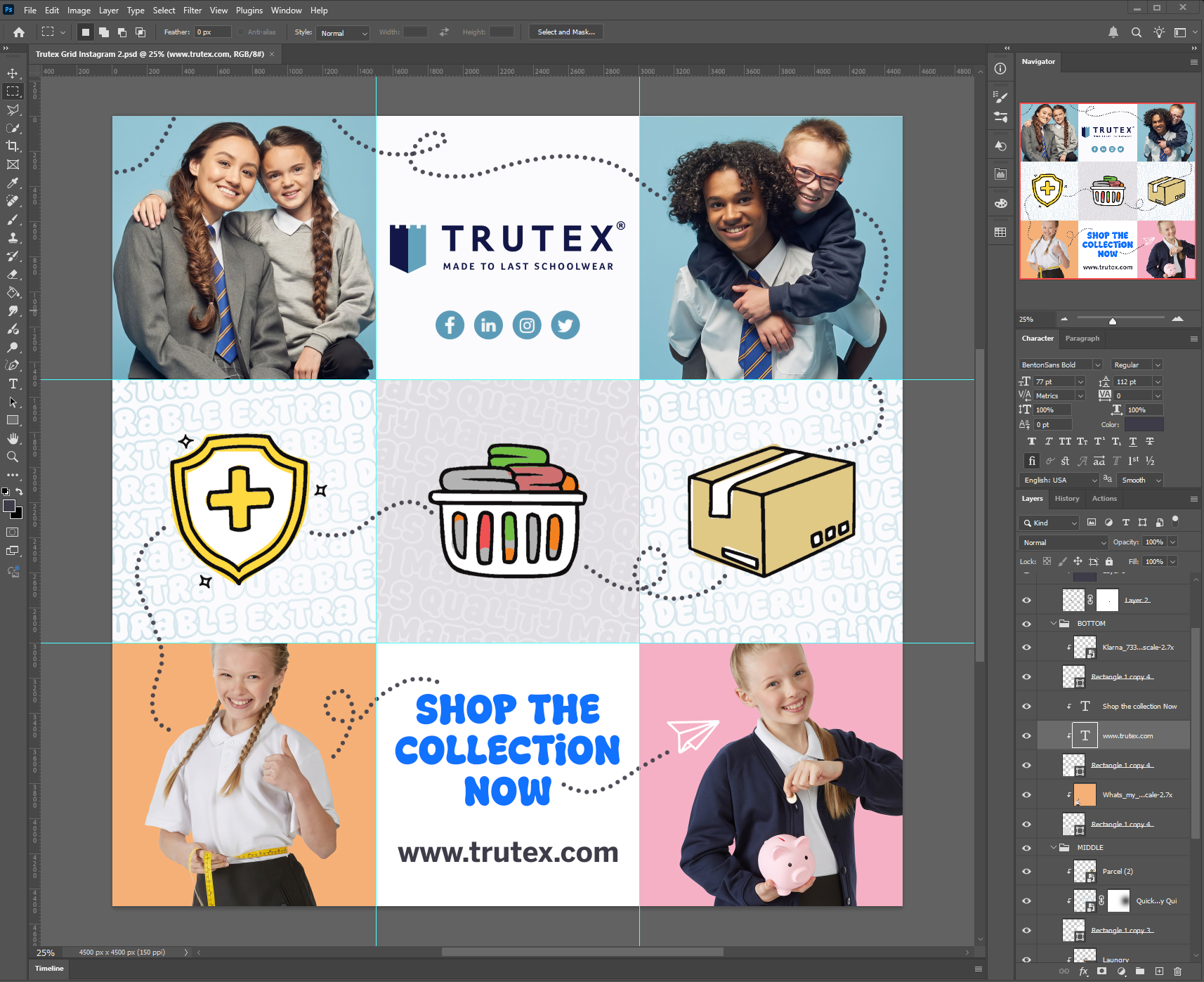
Instagram Grid Post/s

For the grid post, I focused on the BTC (Business-to-Customer) audience, as outlined in the brief. I used negative space to draw attention both to the clothing and to the key messaging, while placing the impactful call to action clearly at the bottom.
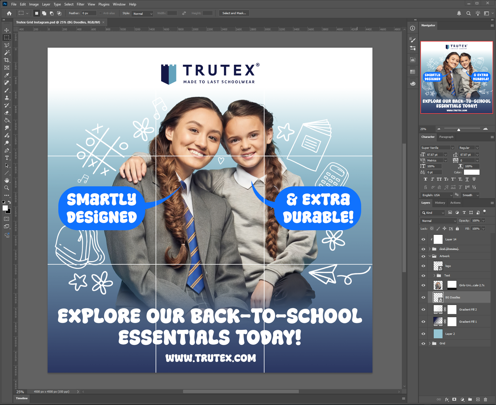
The product image itself was strong and naturally resonated with the intended audience, parents and their children, so I made it the main focal point. To add warmth and a light-hearted feel, I incorporated school-related doodles in the background, which also helped bring extra detail and visual interest.

I felt it was important to include a clear call to action alongside key selling points, specifically highlighting that the uniforms are “Smartly Designed” and “Extra Durable!” and referred to the hierarchy of text rule.
I decided on the font/typeface as I thought it would be more appealing from a parents/child’s point of view because it looks “Inviting” and “fun” in a sense which still conveys an important message whilst bringing attention to the Trutex brand and products whilst being legible.
In regards to the design and posting on instagram, I made the whole document RGB 4500x4500px and 150 DPI, so then I could easily crop each post accordingly without loss of quality to keep everything uniform.